Fish Out of Water: My Experiences Joining the Crypto Community - Part 4: The Standard for Crypto UX

Fish Out of Water Series
Part 1: New Beginnings
Part 2: The Community Shows Up
Part 3: Ethereum Personas
Part 4: The Standard for Crypto UX
Part 5: Product-Market Fit+
Hi everybody! Great speaking with you all again.
Many of you, speaking with us during our Personas user study, indicated that UX was one of the areas where Ethereum needed to improve. Having taken several months to learn about the space, trying our several dapps, designing for our own products, and otherwise immersing myself in Ethereum, I have to wholeheartedly agree. ️🤷🏻♂
In fact, I’d like to share a personal example of how UX in Ethereum impacted me. It was when I bought my own ENS name. Because showing is better than telling, I’ve recreated my experience below:
Step 1: So far so good. This is a very simple starting point. I really like it.
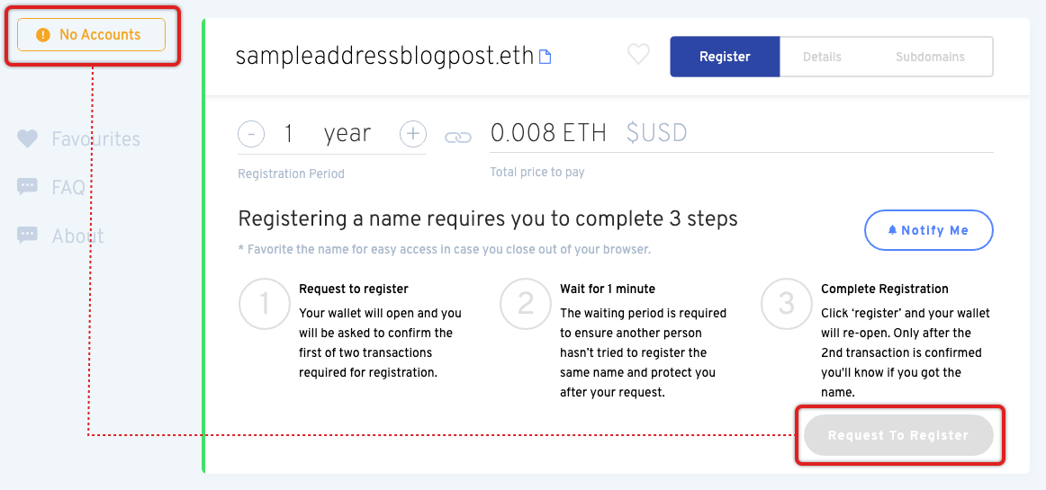
Step 2: Now it gets confusing – as a user I just see that I cannot request to register, with no explanation given. The indicator that I don’t have a wallet is entirely separate from the primary call-to-action and very unclear; most users wouldn’t relate the two or even understand what they mean. Furthermore, the primary information is about the steps to register a name, when it should be about connecting a wallet, since that blocks everything else.
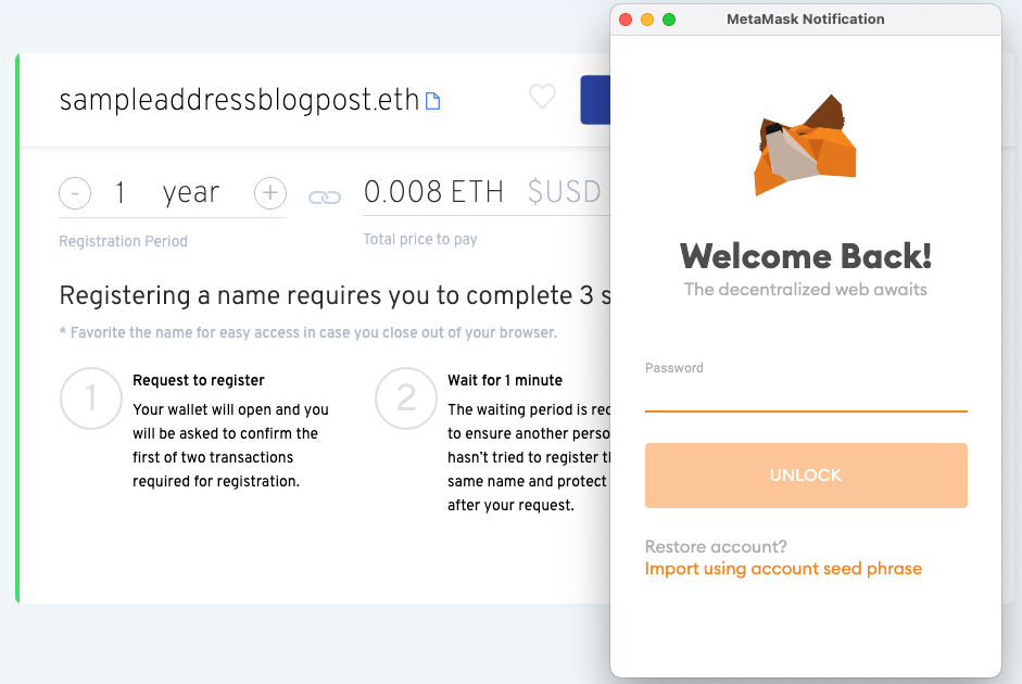
Step 3: I added a wallet and now I could connect, easy enough.
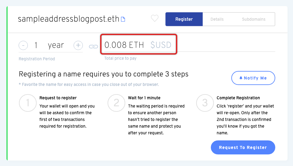
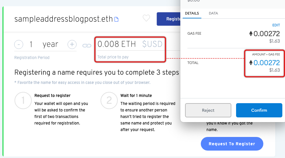
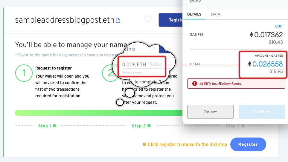
Step 4: I connect my wallet and am back on track. There is a clear registration button for me to click. Also, there is a Total price to pay of 0.008 ETH. What’s very confusing is that USD is mentioned, but the conversion is not provided. ... why? No explanation given. So, I don’t know really know how much it is. That amount of ETH could be a lot or very little.
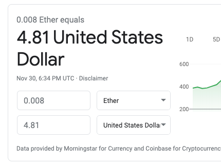
Step 5: So, I go to Google and get the answer I need. $5 is totally reasonable. Again, inconvenient that I have to do this, but anyways...
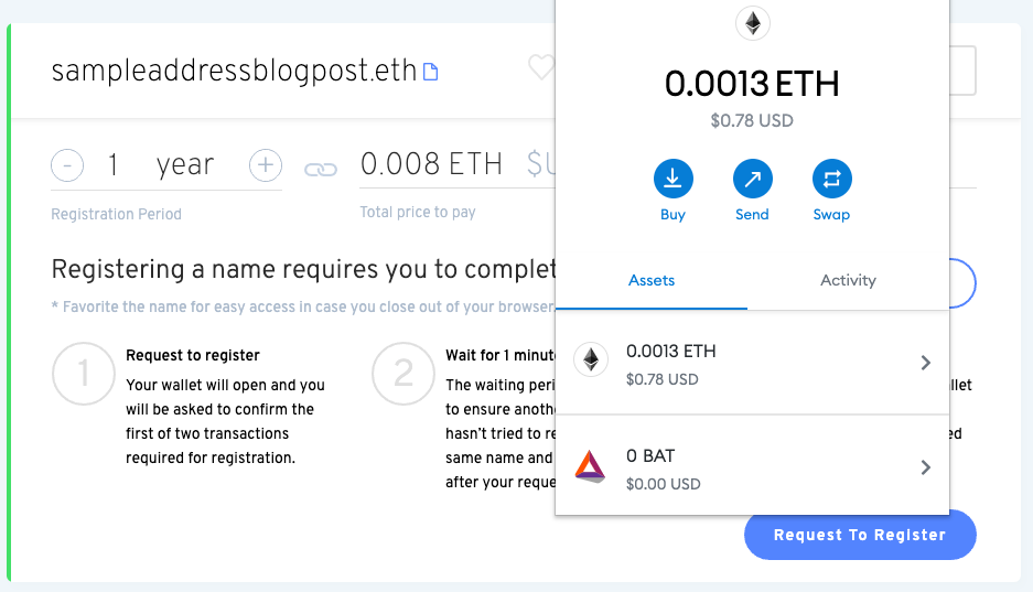
Step 6: I check my wallet and I don’t have enough money, so I have to go load.
Step 7: There is this convenient option. I’ll choose that.
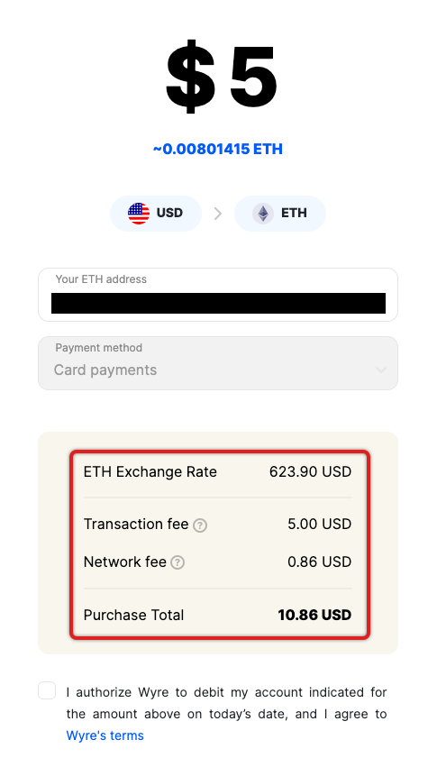
Step 8: I fill it out and... what??? I’m paying more in fees than for the registration??? This is nuts! OK, let’s swallow this bitter pill and continue.
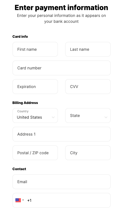
Step 9: Standard form, fair enough. Let’s fill it out and get this done with.
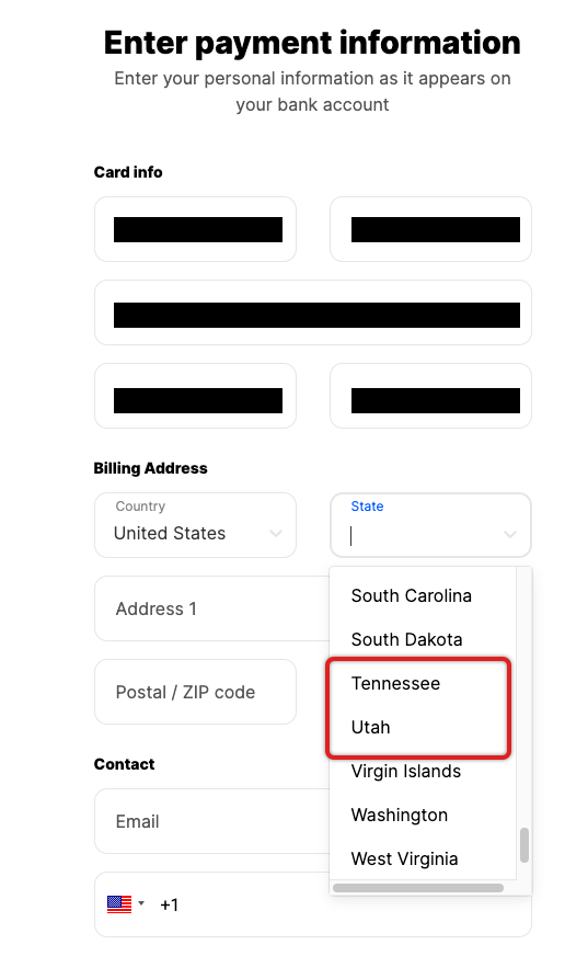
Step 10: After I fill out 6 fields, I get to State and... where is Texas??? It’s just not there. Now I’m stuck and stumped. After a long search in a different tab, I found out that my native state of Texas is not supported by this system. Why didn’t they deem to tell me? It’s easy to detect my general location from my IP and would have saved me a bunch of time and effort. I am now cursing out loud. If I was a regular user, I would undeniably be stuck here.
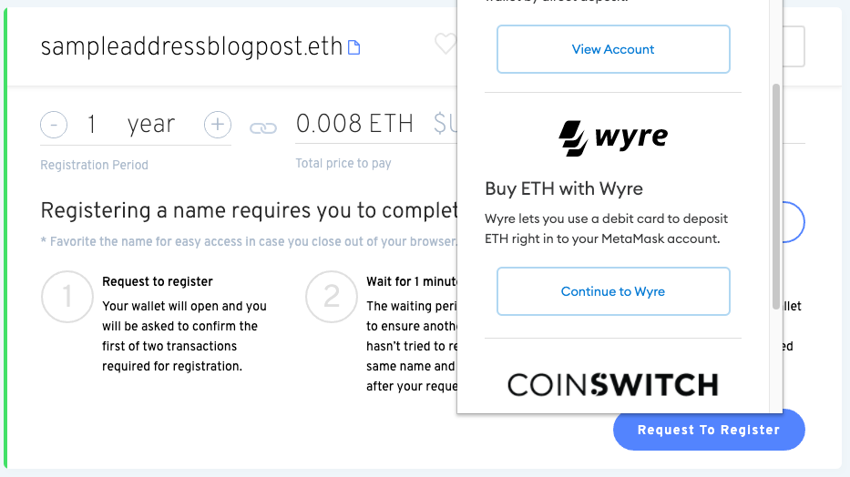
Step 11: But because the user is not like me, I can load money with Coinbase. And the fees are much more reasonable to boot! What’s incredible is that I may have to wait up to 10 minutes to get the funds deposited! In a world where we’re used to having immediate transactions from our credit cards or PayPal, this seems entirely outrageous.
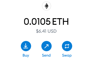
Step 12: Finally, after waiting for what seems like too long, the funds appeared in my wallet.
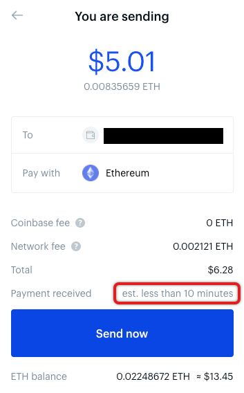
Step 13: I am now ready to pay for my ENS address! Wait, why is the total price to pay different than the total in my wallet? Why did I load $5 if it’s only $1.63? At this stage I am very confused, but grateful that the total turned out to be less.
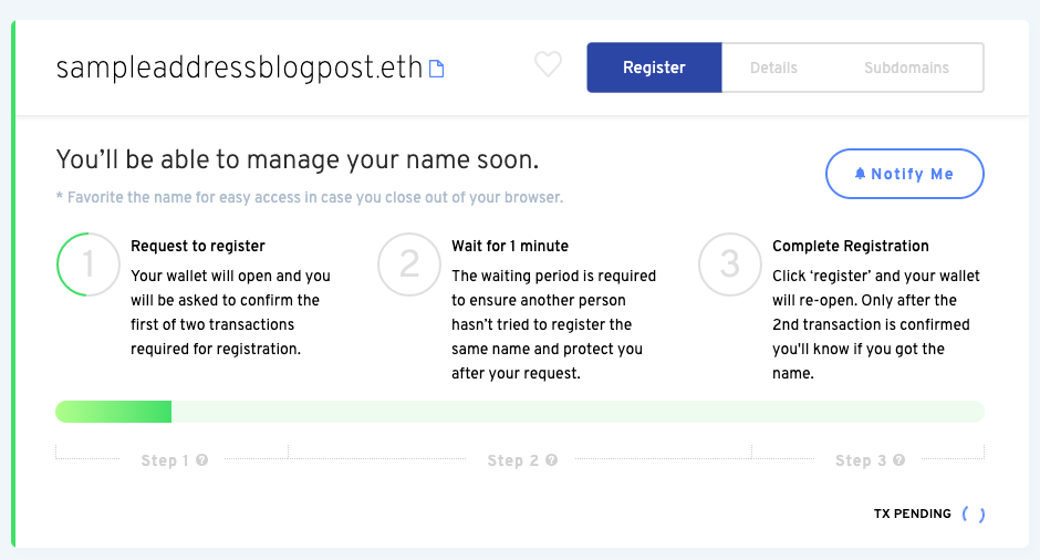
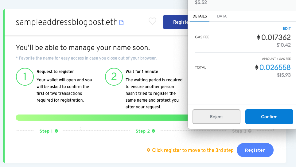
Step 14: Ok, I paid, and I now have to wait 1 minute. It’s to protect me, but the site does not deem to tell me from what or whom (a very important detail). Beyond that, I’d love a countdown timer. Anyway, after more than a minute, this step is still in progress. I thought it’d be a minute, now I’m concerned there’s something wrong.
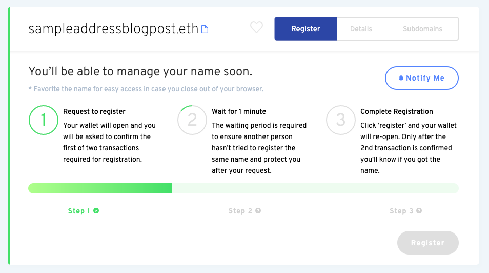
Step 15: After 5 minutes, it turns out the first step is complete, and I now have to wait a minute. What??? I could have sworn I was waiting the minute previously. This is very confusing and making me visibly angry. Again, why is there no countdown timer right now?
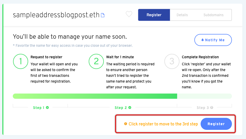
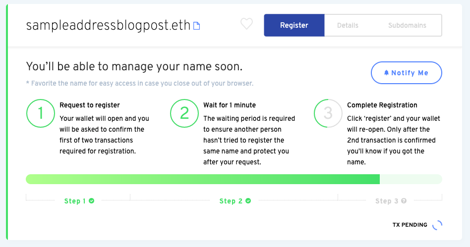
Step 16: I should be done, but somehow, I am not! I become very confused: what’s the difference between a request to register and a registration? I thought I was registering my domain in the previous step! There’s no explanation at all about the difference or why it’s needed. OK, I’ll click the button again.
Step 17: And wait... I have to pay again?!? And the total price of registration skyrocketed?!? Nobody told me I’d have to pay twice! Also, I distinctly remember being told that the total price to pay was around $5, but all told I’ve been charged around $18! At this stage I am throwing furniture and punching walls. This is about as user hostile as you can get, since I already paid before knowing about this second charge.
Step 18: Fuming, I trek over to Coinbase and load funds yet again. So now I have enough money to (hopefully) be able to buy my domain.
Step 19: OK, something good seems to be happening.
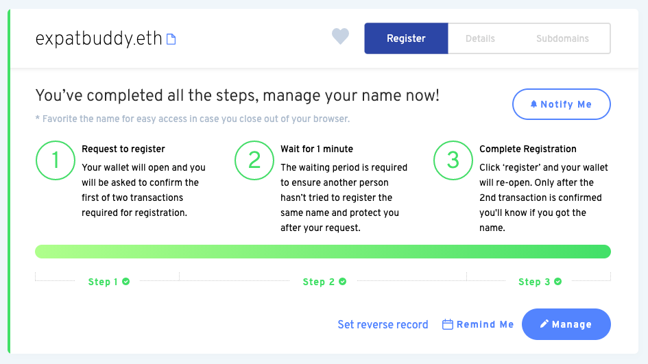
Step 20: Success! Yet it took 20 steps, paying almost 4 times what I expected, and a bunch of painful dead-ends. Also, the design is still not helping me at all. Why am I still seeing the three steps here? Why not automatically help me get started with my new domain? In fact, why not explain each step more clearly instead of leaving the screen identical at each step of the way?
Overall: The process is too many steps and is infuriatingly complex. Regular users would have abandoned the flow too many times. In fact, when I was doing this for real for the first time, I had to get help to complete the flow!
Human-readable addresses like ENS are very important to the long-term success of Ethereum. Furthermore, purchasing a domain is one of the primary use cases for ENS. Yet, even with the importance of this product and use case, the experience is still not up to par. There are usability holes that have been present in the product for over 6 months.
To further drive home the importance of UX for Web3, I will compare it to buying a Web2 domain. Specifically, let’s compare the previous experience with GoDaddy. GoDaddy is the market leader in domains and has well-documented problems with its UX. We can expect the bar at GoDaddy to be low. So, how does GoDaddy measure up to ENS?
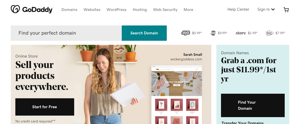
Step 1: A lot of extraneous ads, but the domain search is prominent and easy to find.
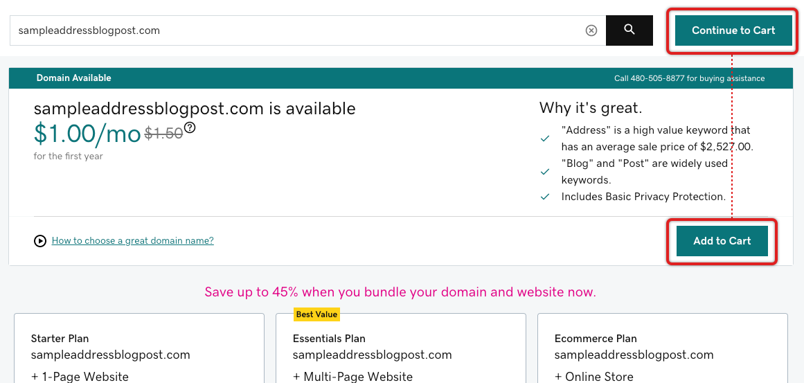
Step 2: The incessant up-selling starts, but the main path is at least at the top and clear. What is weird is that there are two primary buttons, and they are different for no clear reason. Also, does the cart metaphor really apply to an intangible like a domain? In any case, I chose “Add to Cart” since that seems like the path I want.
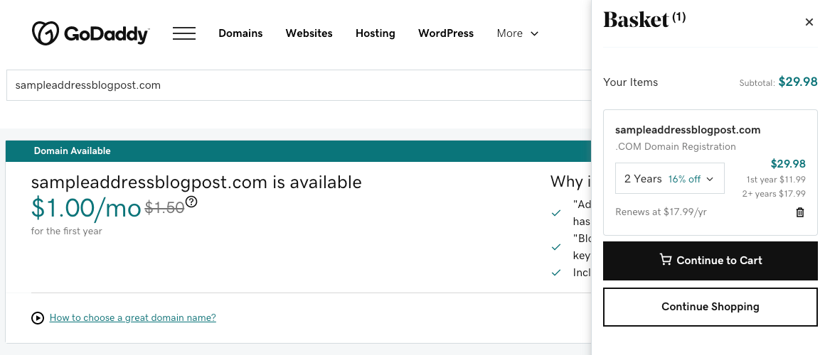
Step 3: A cart sidebar opened showing my domain had been added to the cart. For some weird reason the primary button is now black, but at least it’s clear where I need to proceed.
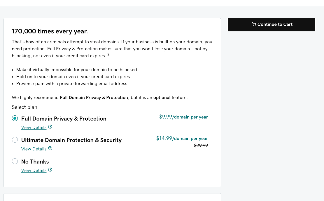
Step 4: I had selected “Continue to Cart”, but I was taken to this weird page. This is very confusing, since it is clearly not my cart and it has a bunch of options that have nothing to do with what I wanted. At least there’s a clear button to go to my cart, so I clicked on it to continue.
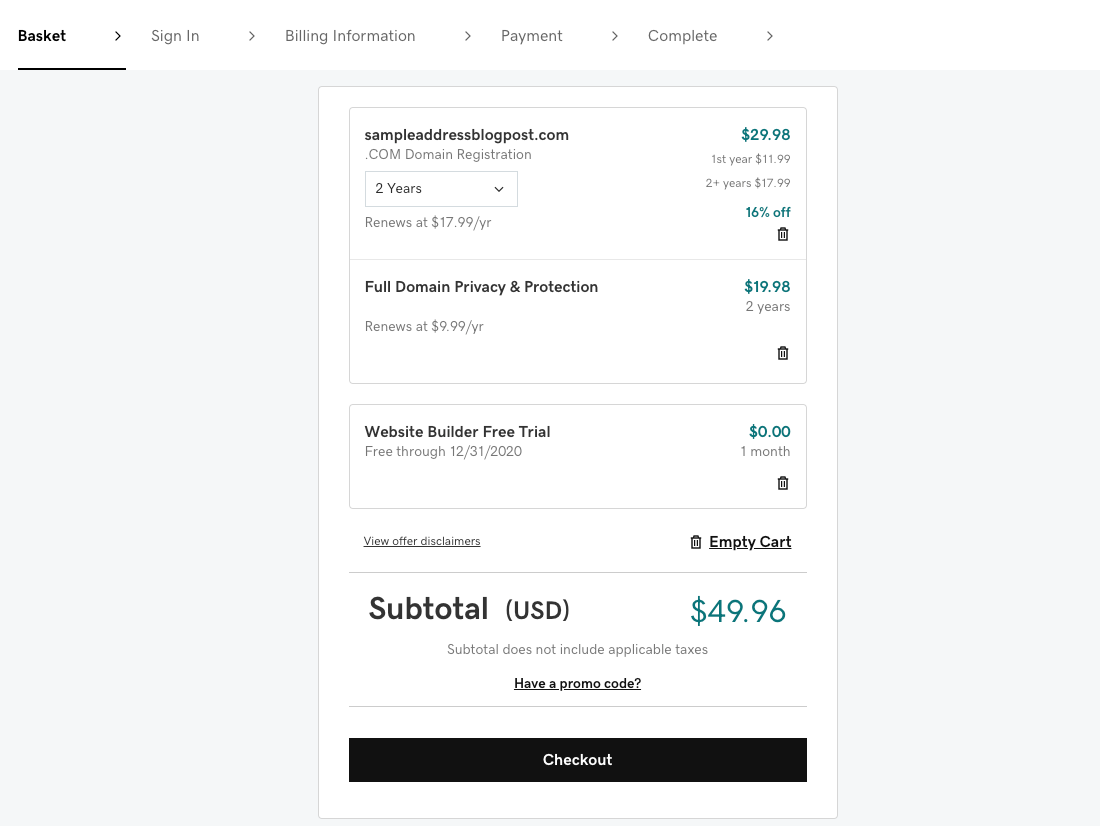
Step 5: The checkout process is focused, simple, and indicates the steps clearly. The page itself is also well laid-out and easy to read. To my unbridled rage, though, I realized GoDaddy had underhandedly added several items to my cart without asking me, bringing the total up more than double! That’s how customer trust is shattered, in this case not with a sledgehammer, but a nuclear bomb. I removed all the extraneous items and brought down the registration to a more-reasonable 1 year.
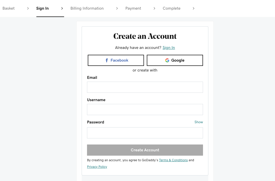
Step 6: Creating an account is reasonable, fairly standard, and worked well. Having Facebook and Google options makes it even easier and faster. I took the manual route in this case.
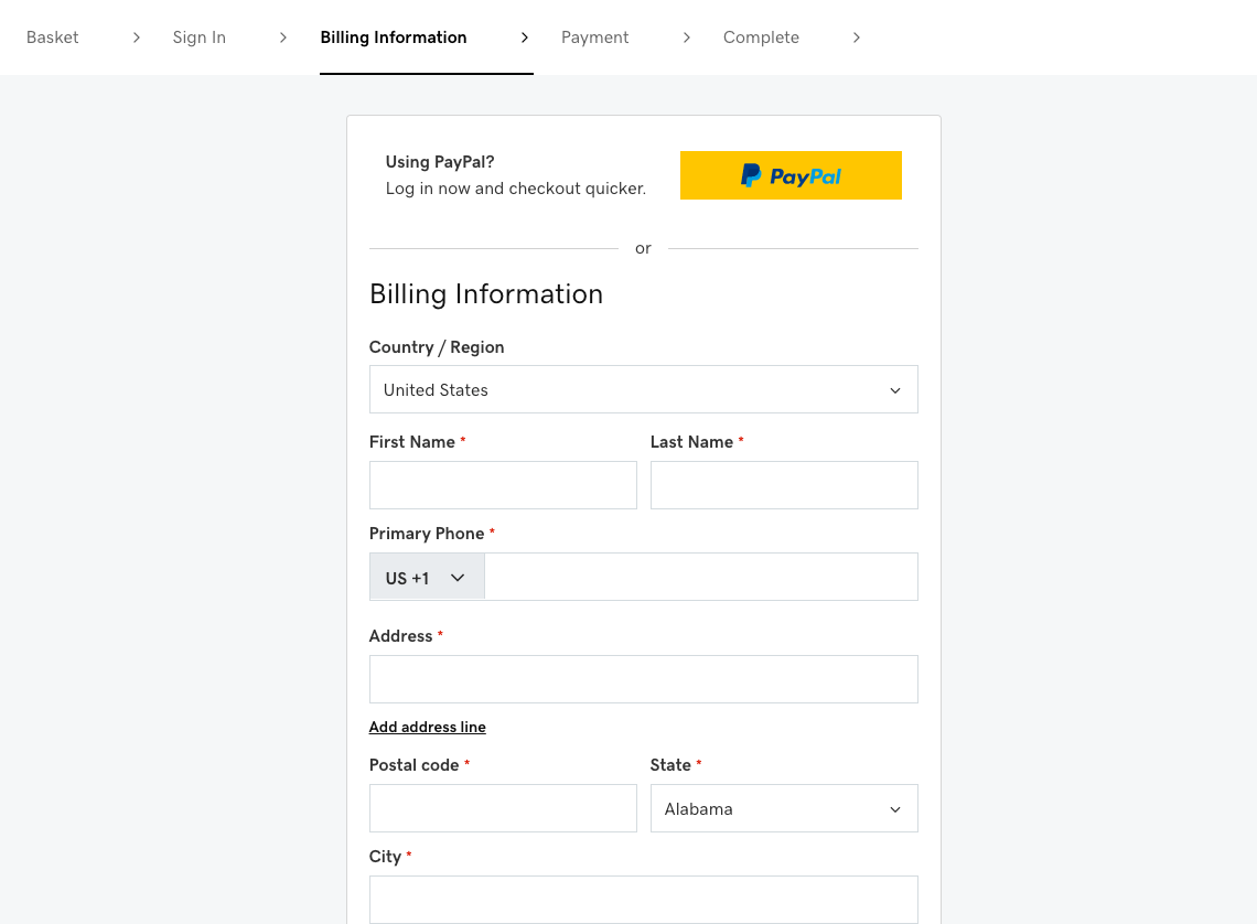
Step 7: This page also worked well and having a PayPal integration was again very welcome. Filling out the billing information may look like a slog, but it matched my address with the Google Maps API, saving me a lot of typing. I would have reduced the number of fields to better communicate this.
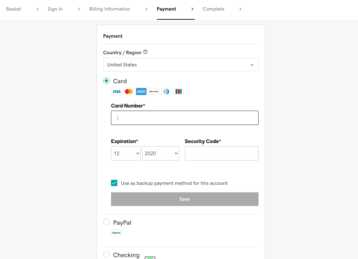
Step 8: Again, a fairly standard payment screen. I appreciated the reduced number of fields and the variety of options. I went with PayPal (which now supports crypto!).
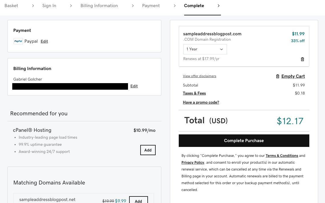
Step 9: The billing confirmation screen again tries the incessant up-selling, but it is clear enough.
Step 10: I suspect this is the confirmation screen plus more up-selling. There is no screenshot because I did not want to give any of my money to GoDaddy after their despicable behavior.
Overall
The process is much shorter and quite simple. They’ve clearly worked to make the checkout process streamlined and intuitive, ensuring customers complete it easily.
What is excessive, disrespectful, and frankly outrageous is the incessant up-selling and the underhanded tactics of adding items to the cart without the user’s explicit consent. This detracts from the checkout process, yet the overall usability is still good.
Even with GoDaddy’s customer-hostile approach, it’s clear that users would be much more likely to complete this process than ENS’s. It doesn’t matter if ENS has better intentions towards its customers, *its integrated end-to-end user experience is simply not good enough.
So, let’s get to brass tacks. The price Ethereum is paying for poor user experiences is untenable. It leads to lower customer adoption, lower productivity, increased frustration, and a more-brittle customer loyalty. Without a good UX, users will not adopt Web3. In fact, merely improving Web3 UX is not sufficient, we actually have to make it better than Web2 UX to get people to switch as we’re also fighting the specter of familiarity and the “good enough”.
So, it’s an uphill battle. Yet, we have the passion, skill, and commitment in this community to make it happen.
What I think is lacking is UX talent. While there are plenty of excellent UX practitioners in this space, there just aren’t enough of us to go around.
With that in mind, we at AKASHA would like to again offer free UX consultations with our Design team to the community. I strongly believe that a rising tide lifts all boats and we’ll win by working together. When we did this previously, we had some very productive working sessions with y'all. 💯
So, like last time, if you have a full-fledged company or project, just an idea, or something in the middle, we want to help you. Please reach out to us at design[at]akasha.world and we can set something up. If Discord or Telegram are more your thing, that's cool too!
We're looking forward to some great consultations!
PS: One other key thing is needed for Web3 to become pervasive: product-market fit. That'll be the topic of my next blog post. 😉
Continue to Part 5: Product-Market Fit+